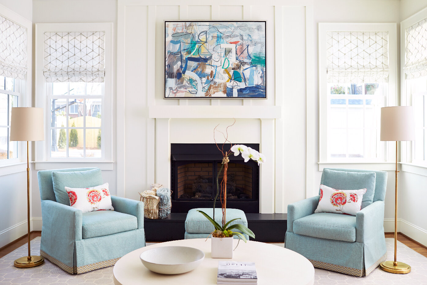
4 Ideas for Styling a Fireplace
As much as I hate saying goodbye to summer, I do love the crisp, cool evenings of fall. There is nothing better than curling up in front of a fire with a good book when the temperatures drop. Most of the houses that I design have at least one fireplace, and often two or more. Almost all of those fireplaces have mantels and styling that small piece of real estate is difficult for a lot of people. So I have 4 fail-safe ideas that will give you a well-styled and welcoming fireplace. Let’s take a look:
Kara Cox Interiors
1. Create Layers
Well-edited surfaces always have layers and depth. You want to have a central piece to design around, like a mirror or a piece of art, and then add varying heights of items. Those can be sculptures, pottery, mementos and more. Be sure to place smaller items in front of larger ones to create that visual interest. I also like to include different textures and materials. But don’t just choose items from a big box store - always display things that mean something to you, that you collected, or things that show your personality.
Kara Cox Interiors
2. Try Asymmetry
Because a fireplace has such strong symmetry in its design, I like to add a bit of asymmetry to a mantel. In the photo above, you can see that balance of the art and two sconces. So I added two vases just on one side. It keeps the look from being too rigid and boring. There’s an element of surprise to this look now. And note that I used differing heights for the vases I chose.
Kara Cox Interiors
3. Have a Strong Focal Point
No matter what you decide to include on your mantel, be sure you start with a strong focal point - which is often either art, a mirror, or a large photograph. The fireplace is already a large black box that will draw attention, so the key is to have something to draw your eye up and away from the firebox. Pay attention to scale so you have art or a mirror that offers the right proportion for the space.
Kara Cox Interiors
4. Go Sleek and Chic
If you have a very shallow mantel, you may want to just go with a simpler look like a single painting. In the room above, I chose to just showcase art above the mantel because there’s already so much going on in the shelves that surround the fireplace. And I took the same approach below with a shallow mantel that didn’t offer any room for more decor. The look is more streamlined and edited, which is a great choice in a room pattern and color.
Kara Cox Interiors
Try these ideas to get your fireplace ready for the cooler weather heading our way. If you need our design expertise, be sure to reach out to my team!
All the best,
Kara


