Before and After: A Mid-Century Makeover
Kara Cox Interiors
If you read my blog post last week, you know how much my team and I enjoy the big reveal at the end of a project. The transformation of a house from ho-hum to wow-worthy is so gratifying. It makes all the work worthwhile. Before-and-after shots are always fun, so I thought I’d show you a peak inside my personal mid-century home that we renovated for our family. We’re about to tackle our next round of renovations adding a keeping room to our kitchen, renovating our home bar, and a complete makeover to our outdoor living area! These rooms will all look different in a few months so look for future posts on our own design process and how we manage living through a renovation!
Living room, before
Living room during renovation
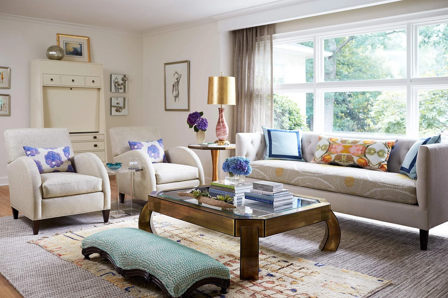
Living room, after a Kara Cox Interiors renovation
The Living Room
This home definitely had great bones, like the floor to ceiling window that greets everyone on the front of our house, but the aesthetic was not in line with the original style of the house. It had been remodeled over the years and the entire first floor was covered in terra cotta tile with very Mediterranean wrought iron details and fixtures. Those were the first things to go, and we replaced the floors with hardwood that was used throughout the home. We widened doorways, arched openings, and updated finishes for a casual, modern feel.
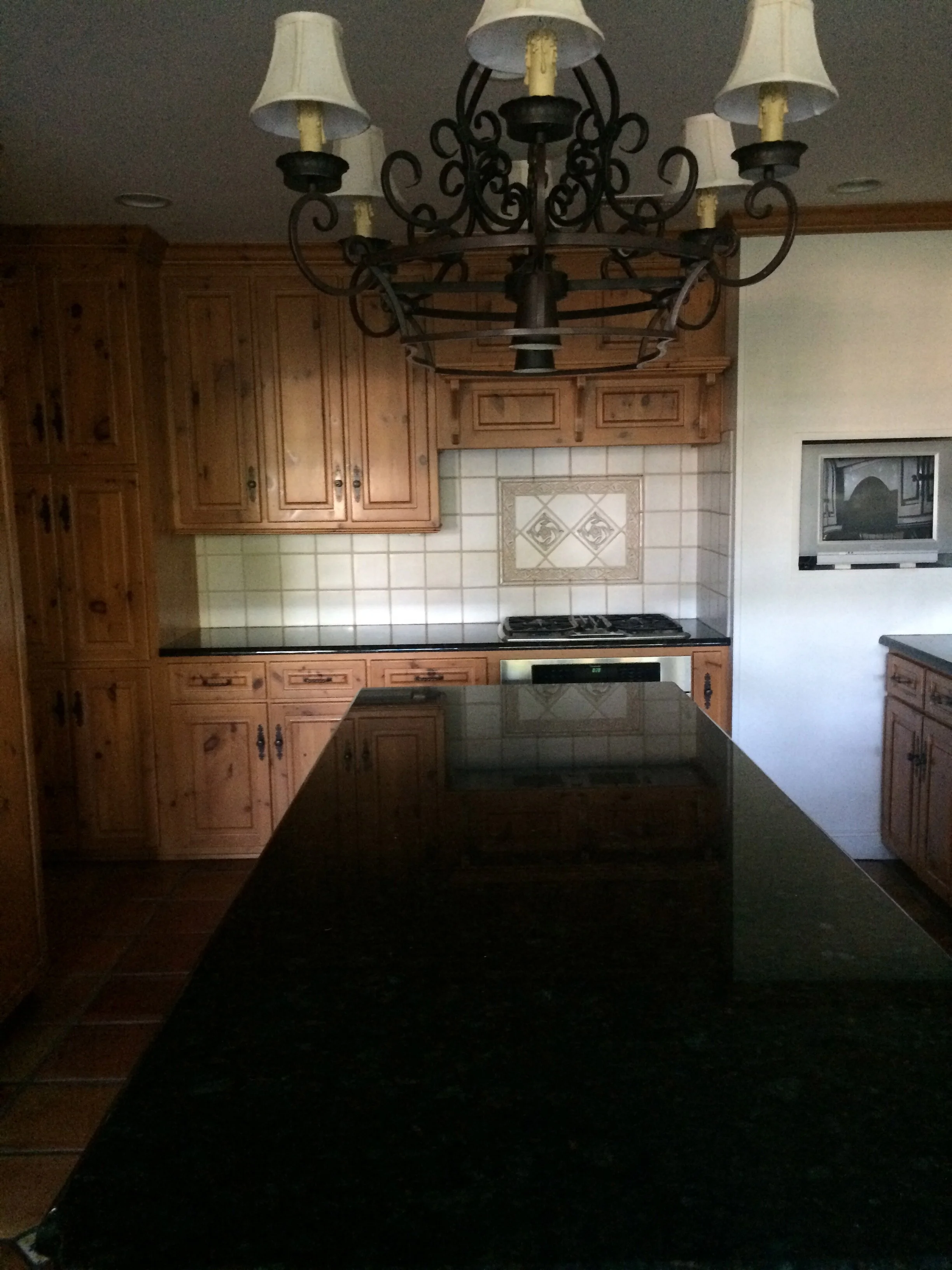
The kitchen, before
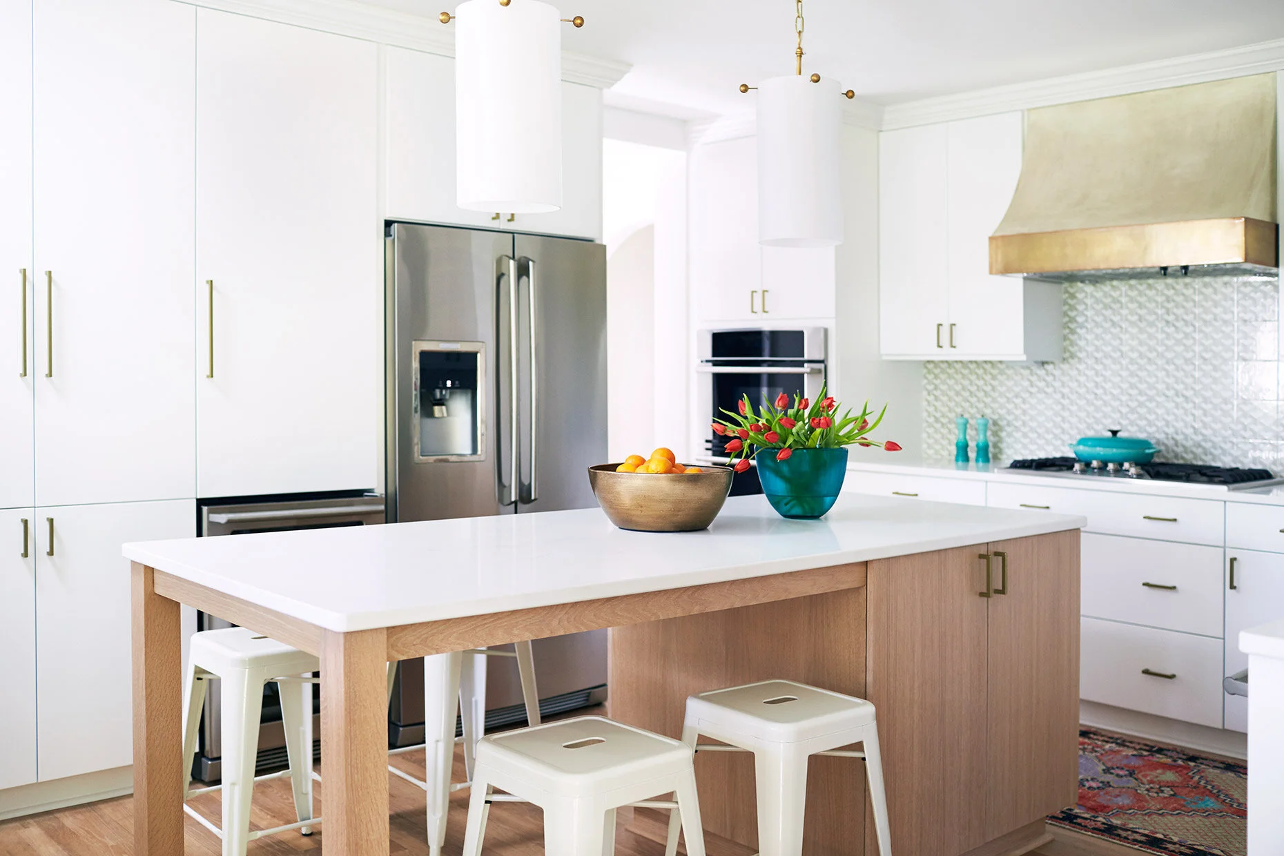
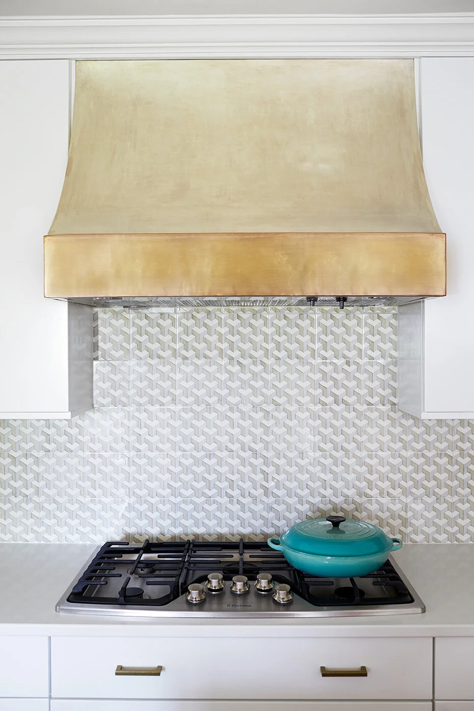
Kitchen design by Kara Cox Interiors
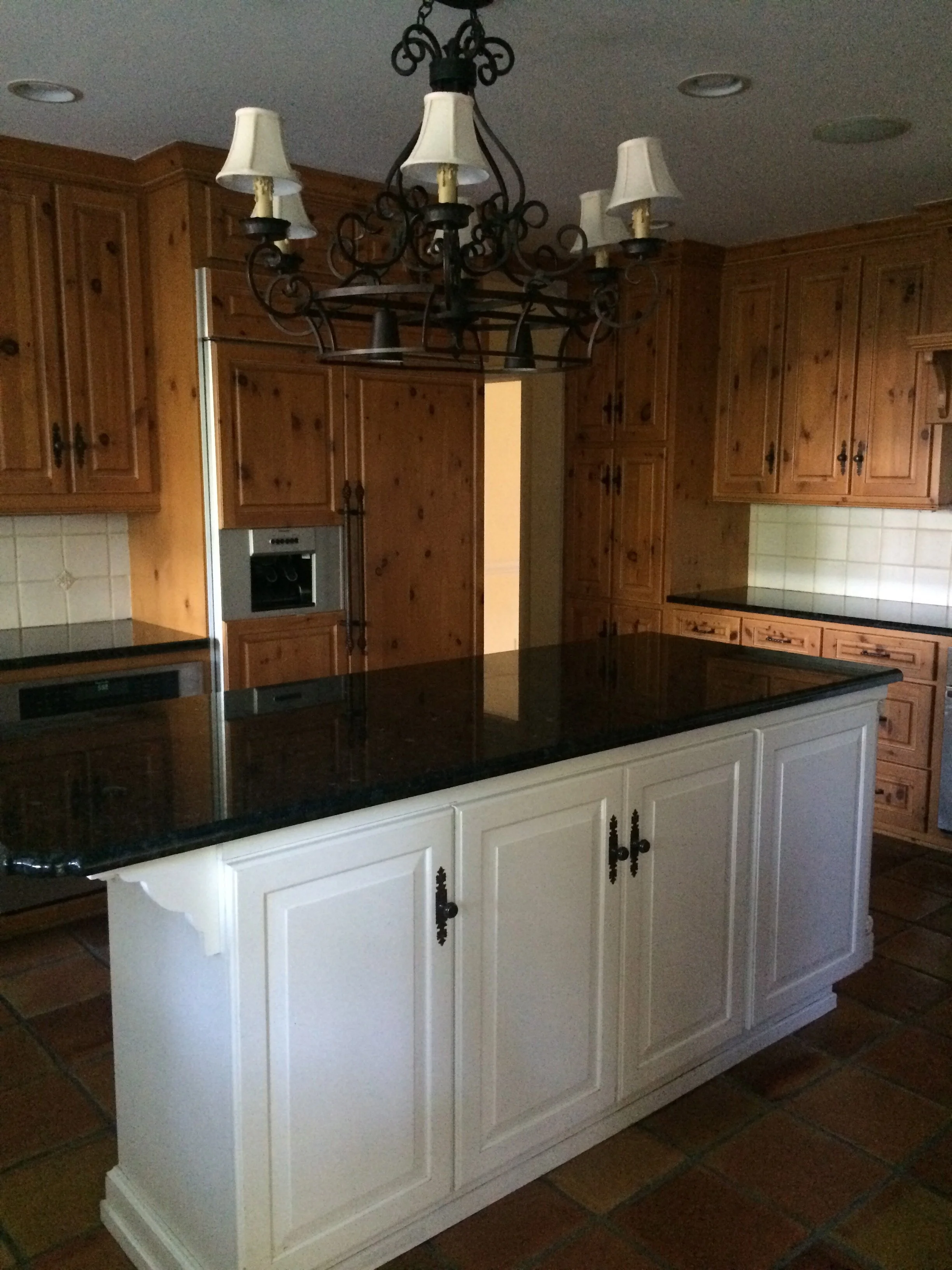
Kitchen before
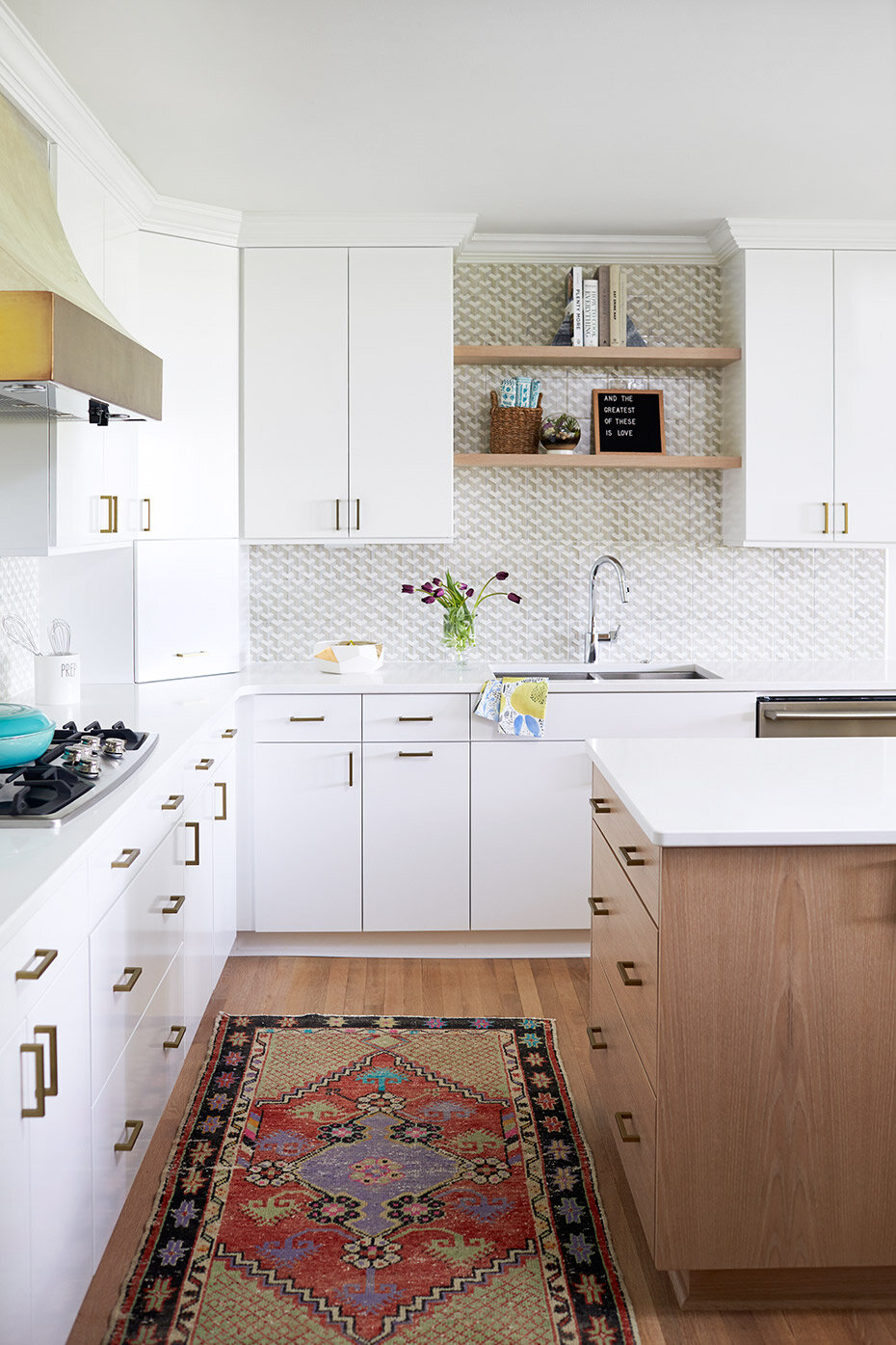
Kitchen design by Kara Cox Interiors
The Kitchen
The kitchen was one of the darkest rooms in the house with an Old World rustic look that was not only dated, it also didn’t match the style of the house. I wanted to brighten this room, too, of course, but also add some unique details like the tile backsplash and a custom range hood. And we ripped up that tile floor in this room, too. That was a lot of tile! Soon, our kitchen will extend out into a keeping room with large sliding doors into our backyard patio. It will really open up the room and give us a second casual dining area.
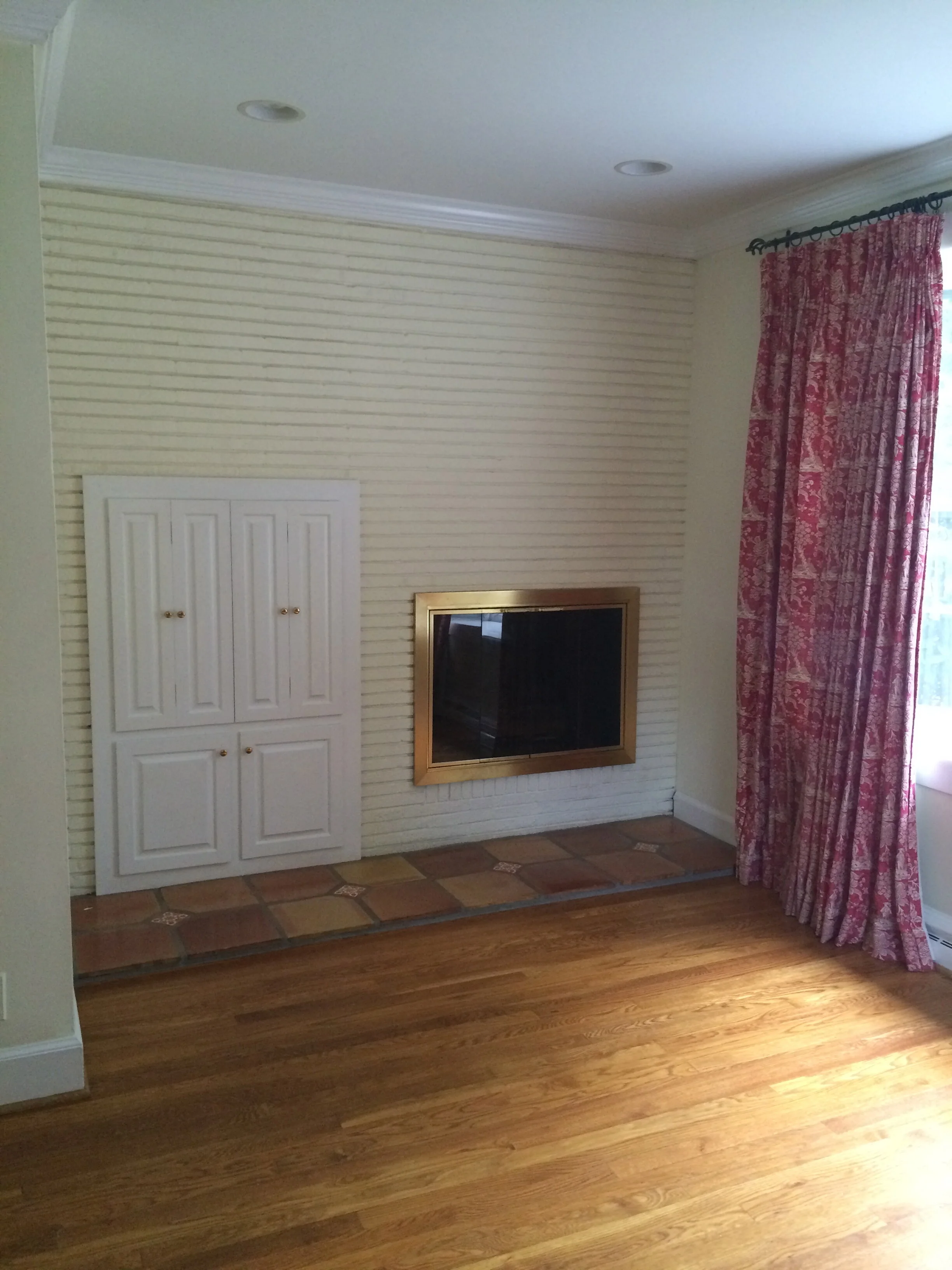
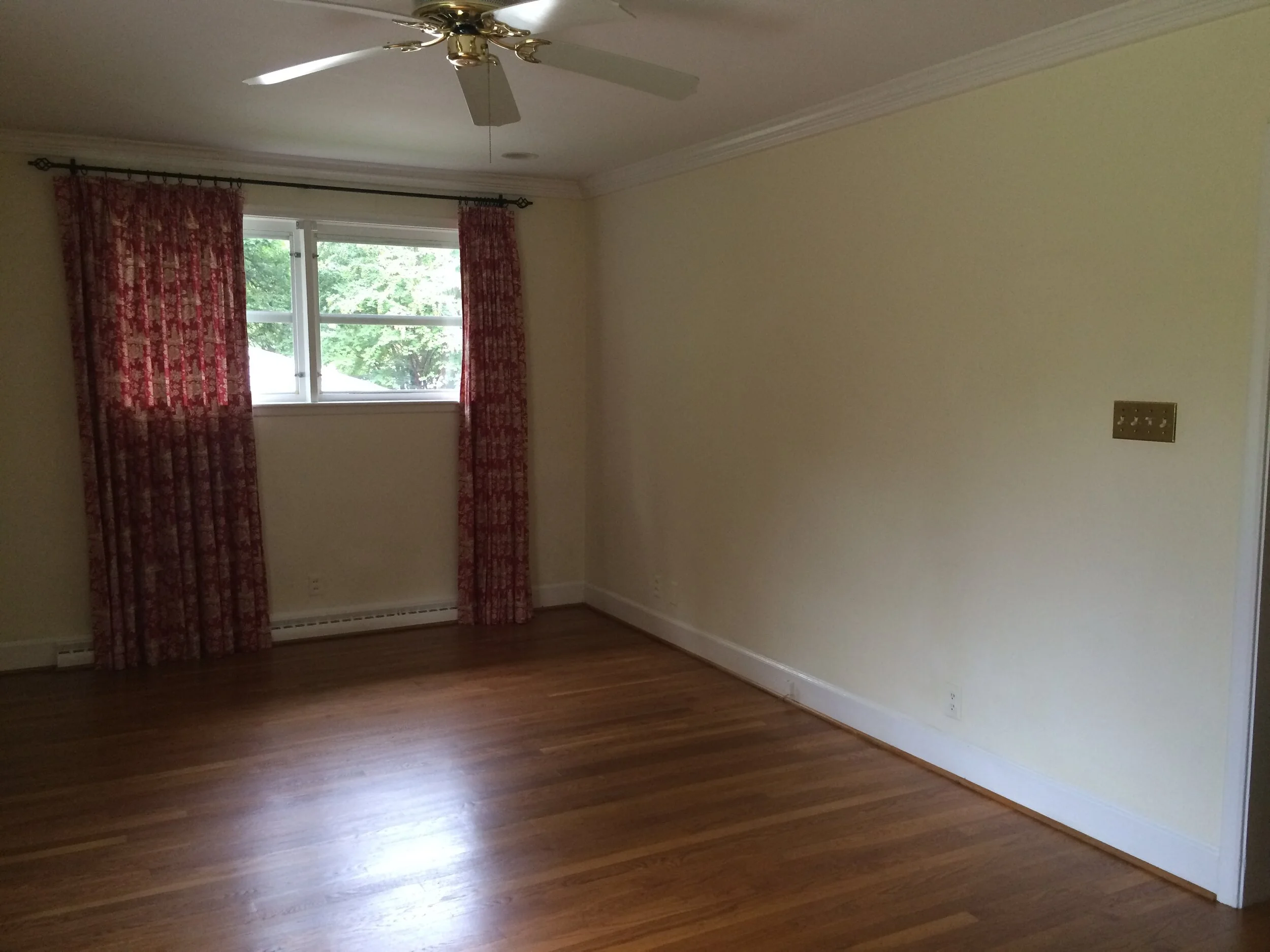
Primary bedroom, before
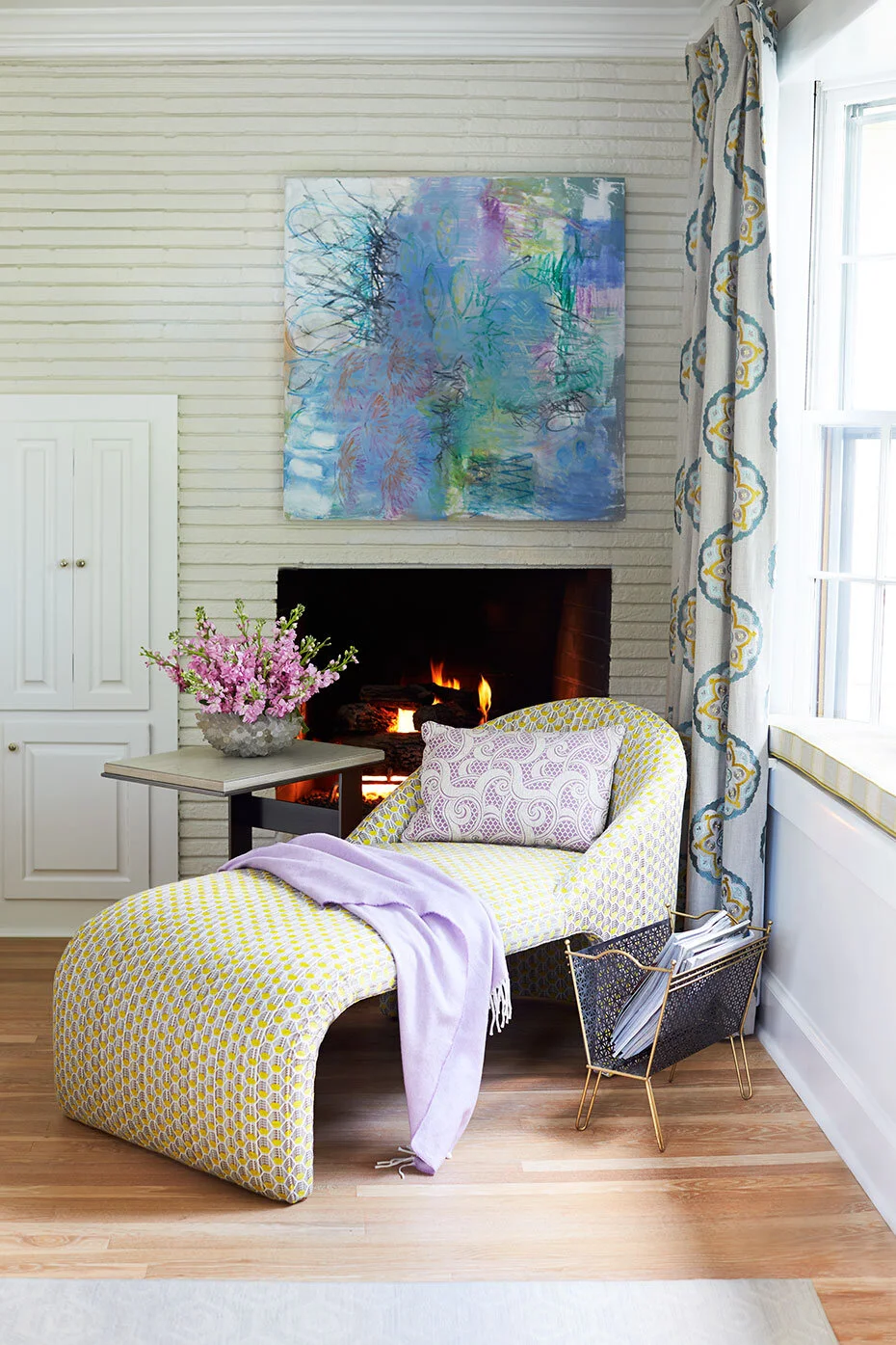
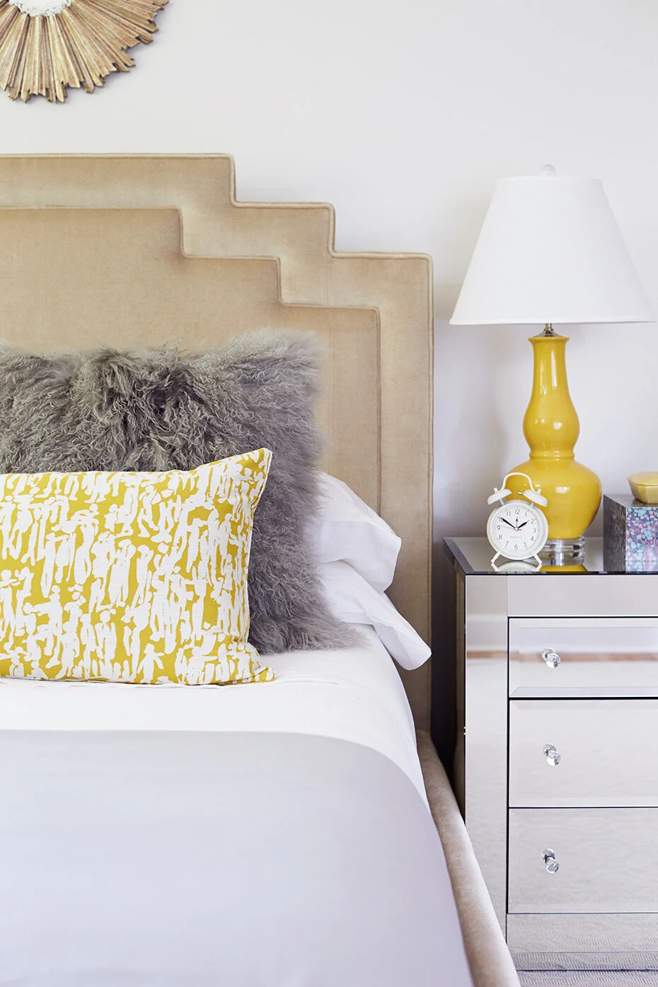
Primary bedroom design by Kara Cox Interiors
Primary bedroom, before
Primary bedroom design by Kara Cox Interiors
The Primary Bedroom
Is there anything more romantic than a fireplace in the bedroom? We knew we wanted to keep that feature in the primary bedroom, as well as the brick-textured wall. But the strange strip of tile (again with the tile!) needed to go. We made the room serene with layers of neutrals, while also adding pops of color in the accessories and art. This is a now a dreamy space for relaxing and recharging.
Like many of our clients, we’ve tackled our home renovations in phases to create the dream home we love over time with thoughtful planning. We love creating homes that have an upbeat vibe for families and are as functional as possible for our clients. We’ve learned through experience how to see the vision for a home with great bones and location but in need of TLC! Do you have a dated home and need to see the potential? Give us a call!
All the best,
Kara

